Selected work
I've led the Axios data viz team since 2019, which means most of my best work lives under someone else's byline. Some of the projects below represent a slice of what I've edited and directed. The bylines belong to the talented visual journalists who built them.
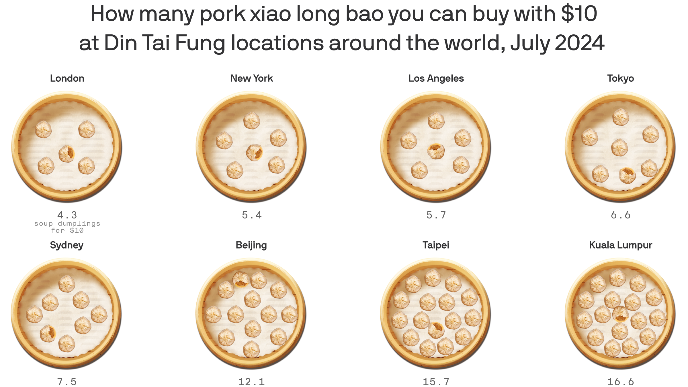
Where Din Tai Fung’s xiao long bao are cheapest
The Big Mac index, but make it juicy.
View story →

Is 2024 the Cicadapocalypse or a Cicadapalooza?
The "cicadapocalypse" was real, but the data shows 2024 was just a warmup. The real
spectacle comes in 2089.
View story →
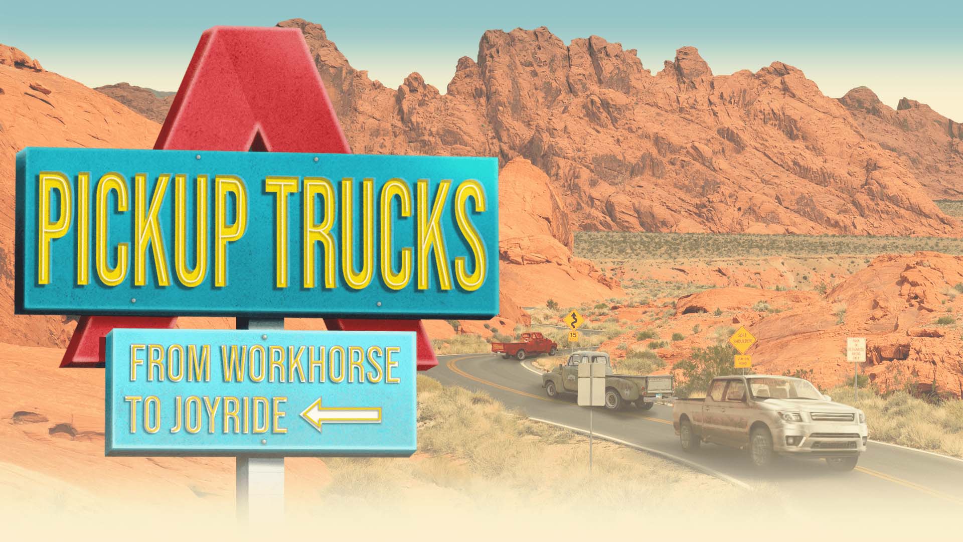
Pickup Trucks
Pickup trucks didn’t just get bigger. They got more cab, less bed, and more dangerous.
A data-driven special project tracing 50 years of the F-150’s transformation and what the numbers say about
the cost of that shift.
View story →
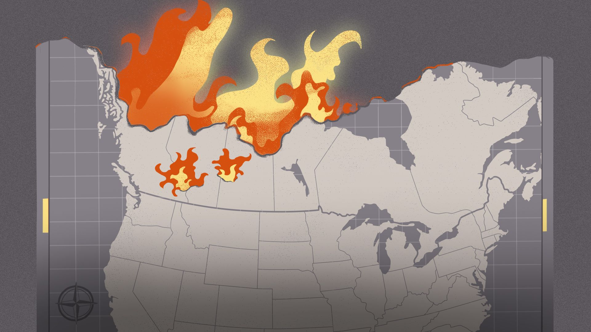
Haze: How Canada’s wildfires devastated U.S. air quality
2023 was the worst year on record for wildfire smoke in the U.S., and it wasn’t close.
A look at how Canada’s record fire season hit air quality across the country, and what it means for summers
ahead.
View story →
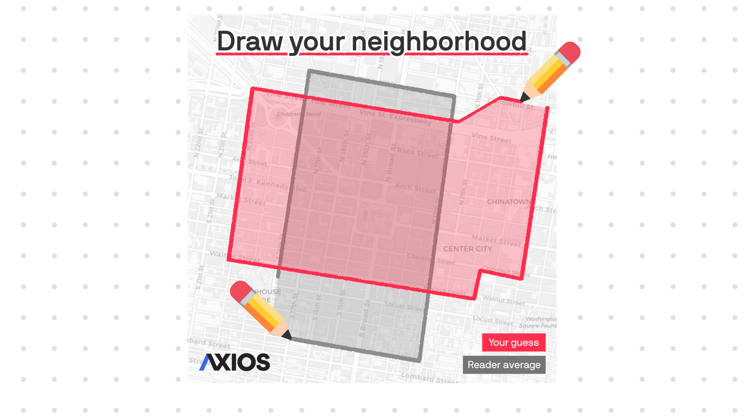
Draw your neighborhood
Ask ten people where a neighborhood starts and ends, and you’ll get ten different
answers. This game let Axios Local readers draw their own neighborhood boundaries across 20 U.S. cities and
compare their results to other players. Shortlisted for an Information is Beautiful Award and winner of the
SND Award of Excellence.
View story →
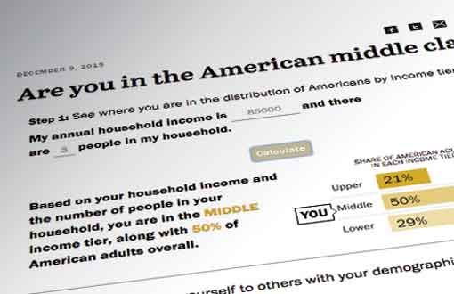
Are you in the American middle class?
An income calculator that tells you where you fall on the economic ladder, adjusted for where you live and who you are. Built at Pew Research Center and updated annually since 2015.
View story →